May 2024 - Jan 2025
In Brief
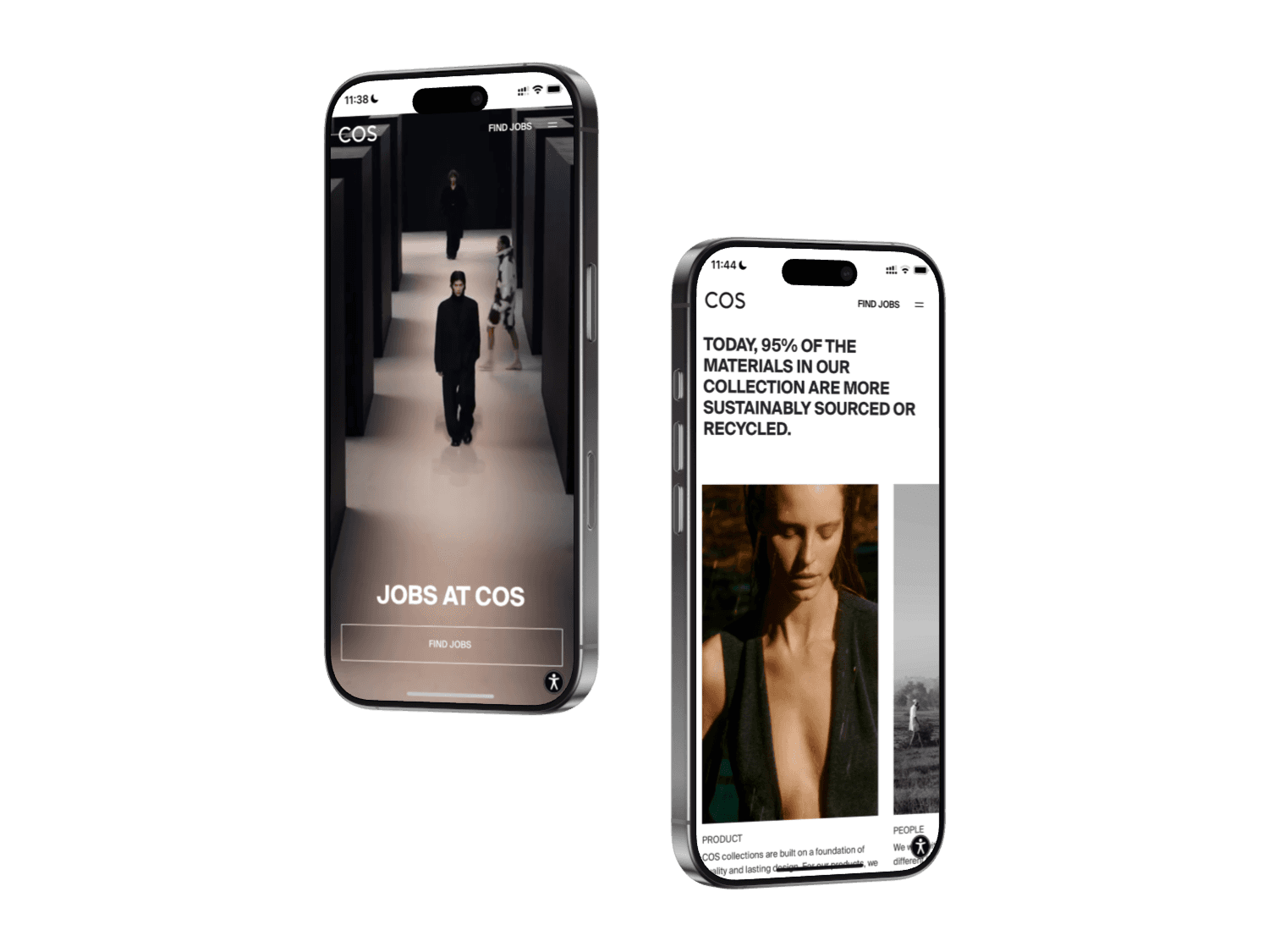
I was brought in to lead the redesign of COS Careers — creating a visually cohesive and user-friendly platform that reflects COS’s refined aesthetic while making job discovery and applications easy.

Challenge
The existing careers platform no longer matched COS’s updated brand experience. It felt visually disconnected from the e-commerce site and didn’t reflect the same level of polish, clarity, or ambition. The challenge was to create a unified experience that stayed true to COS’s minimalist aesthetic, while also addressing the practical needs of job seekers: easy navigation, clarity of information, and a smooth application.
Approach
Working in close collaboration with COS’s Head of Digital Design, I translated the current career site into an experience that matched the updated brand identity. This involved reworking the site’s structure to improve clarity and usability, while applying a UI design that aligned with COS’s visual direction. Throughout the process, we balanced form and function — ensuring the site felt as effortless to use as it was stylish to look at.
Solution
The final design presents a clear, elegant interface with a simplified job search and application flow. Thoughtful use of typography, layout, and interaction design brings consistency with the e-commerce experience, while maintaining a distinct tone suited for employer branding. The site now feels like a natural extension of the COS brand — calm, minimal, and purposeful.
Impact
The new careers site strengthens COS’s brand perception for prospective talent. It offers a seamless transition from browsing the brand as a customer to exploring it as a potential employee. By elevating the experience, COS is now better positioned to attract the right people — and leave the right impression.
Reflection
This project reinforced the importance of aligning brand and experience — even down to the smallest details. Balancing a strong visual expression with real usability showed how consistency across touchpoints can strengthen both perception and trust.
Looking back, one area that deserved more focus was accessibility.
Rather than building accessibility directly into the experience, the existing overlay solution was kept — a compromise that can itself create barriers by requiring activation. In hindsight, I wish I had pushed harder for a more inclusive, built-in approach, and it’s a lesson I’ve carried forward.